Why aren’t digraphs like qu, double consonants (ff, gg, ll, ss, zz), or vowel teams shown on a single tile?
Wouldn’t that make it easier for students to remember the correct spellings?
Excellent question.
We thought carefully about this design choice, weighing two possible approaches:
The Holistic Approach – placing digraphs (like qu, th, or ee) on a single tile to help students see them as a unit.
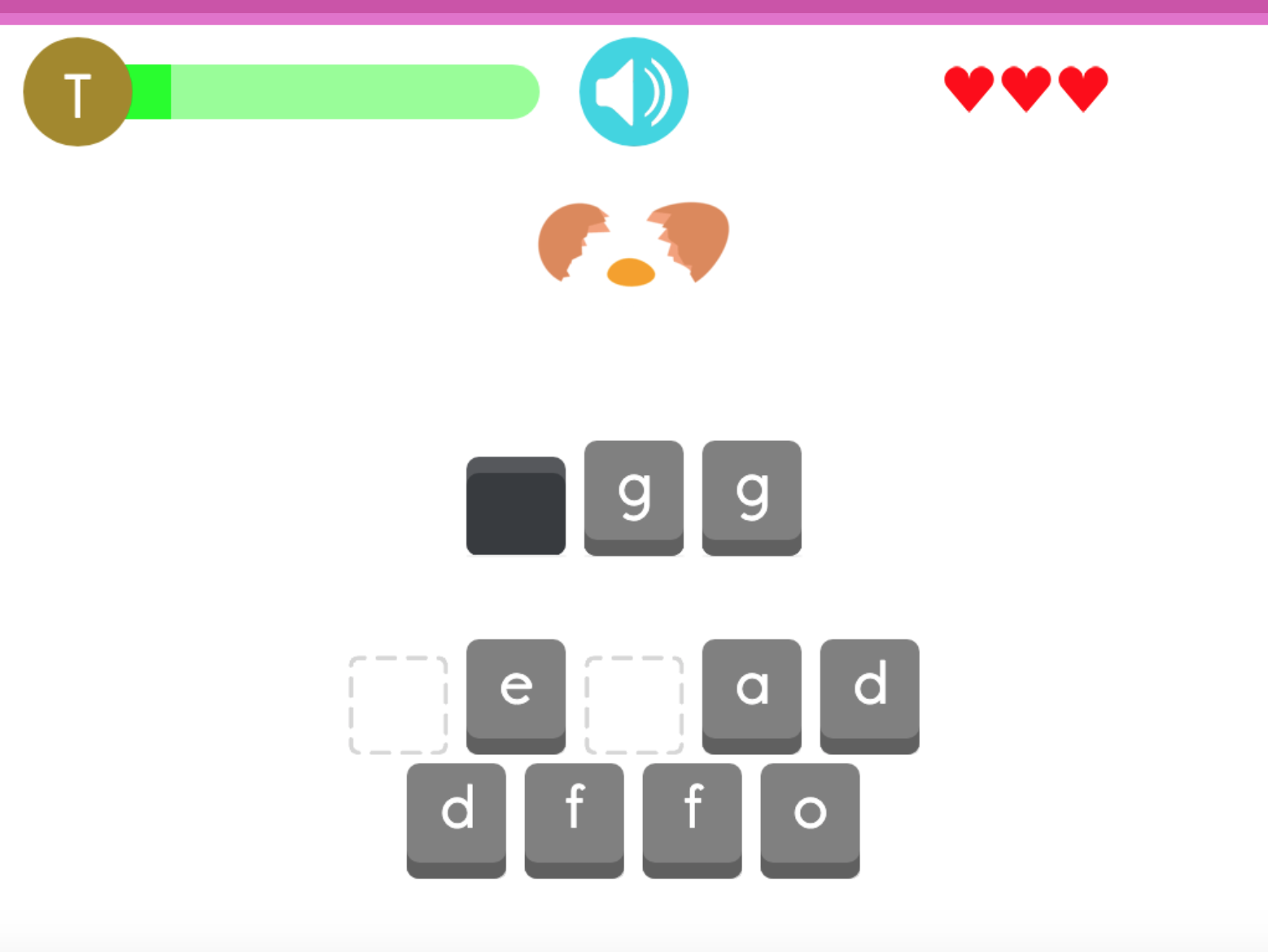
The Synthetic Approach – keeping each letter on a separate tile, encouraging students to build the digraph themselves.
We chose the Synthetic Approach for two key reasons:
It reflects real-world spelling and reading. Students need to recognize that certain sounds are made up of more than one letter. Keeping the parts separate helps prepare them for actual writing and keyboard use.
It strengthens memory through recall, not just recognition. When "th" is shown on one tile, students only need to spot it. But when they must combine t and h themselves, they rely on memory. This “desirable difficulty” boosts learning and retention.
In short, while both approaches have merit, the Synthetic Approach better supports long-term literacy development.